CRO audit of today’s homepage
Numbered findings pinned on paymentiq.com, with severity and a recommended fix for each, connected to your brief.
Open CRO audit ↗


November 2026 / ©Flowout
Compare four homepage directions and their related versions. The first follows PaymentIQ’s brand and the structure from your brief; the second explores a more modern, editorial finance look; the third tells the story as you scroll; the fourth leads with video.
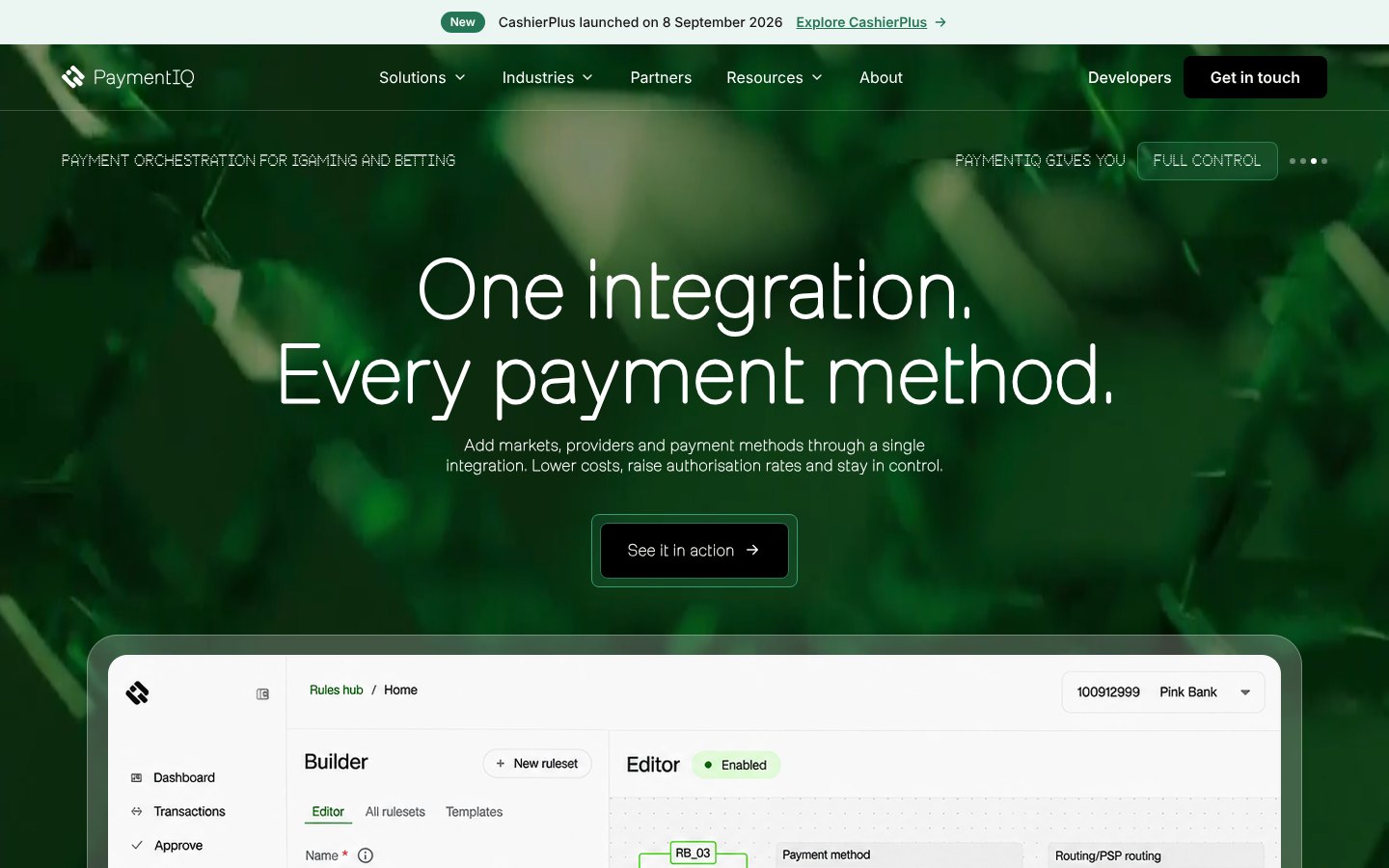
01 / Client brand & structure
A working homepage built on PaymentIQ’s own brand: Milling and Thermochrome type, the brand greens and the content order from your brief. Use this direction to check what the homepage includes and how visitors find it.
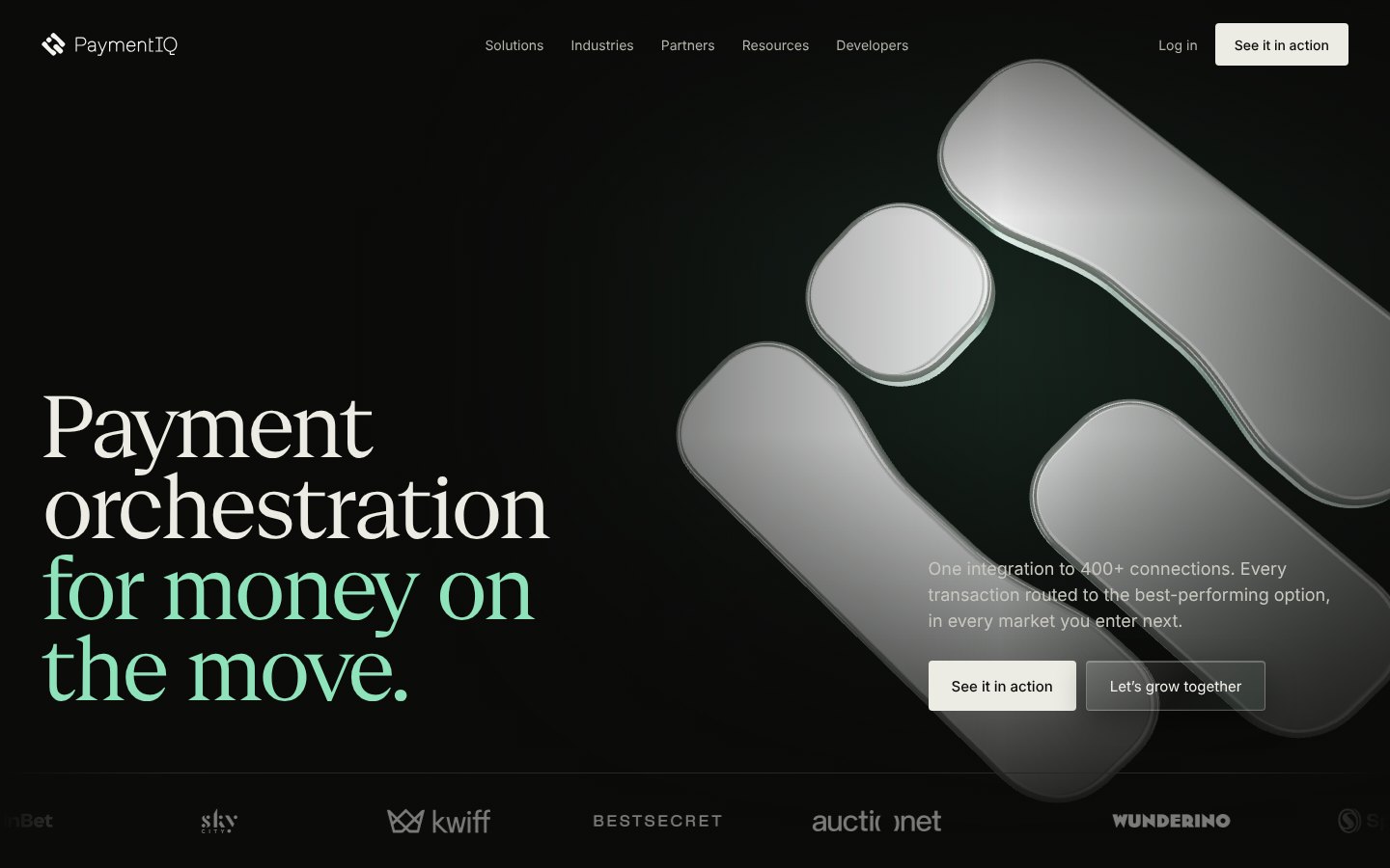
02 / Modern finance editorial
The same story, told with the confidence of a modern finance brand. For this direction we changed the headline typeface to Geist Serif on purpose, to show how a sharper editorial voice shifts the feel while the brand greens stay.

03 / Scrollytelling
Your brand fonts and greens, told as one continuous story. A glass 3D mark opens the page, then fades as a green curtain rises with the key figures. Each section hands over to the next as you scroll.

04 / Video editorial, dark to light
Opens on a full-screen video of a payments lead using the Rules hub, then moves from dark to light as you scroll. Set in your brand font, Milling Simplex, it brings together the strongest parts of our earlier explorations.
Numbered findings pinned on paymentiq.com, with severity and a recommended fix for each, connected to your brief.
Open CRO audit ↗How Praxis Tech, Primer, Gr4vy, Spreedly, IXOPAY, Finteqhub and Fluid present orchestration, structure and proof.
Open competitor overview ↗