← Back to project review

Our approach / November 2026

How to read the designs

Four directions answer the same brief. One keeps PaymentIQ’s brand and the structure you gave us. Another shows how far the same content can move towards a modern, editorial finance look, the third tells it as a scrolling story, and the fourth leads with video. Neither is final. The aim is to choose what works from each.

A simple way to review

  1. 01Start with the structureCheck the content and order in the client structure design. Is anything missing or in the wrong place?
  2. 02Then look at the feelOpen the editorial version. Which moments feel more like the brand you want to be?
  3. 03Compare section by sectionUse the pairs below and note what you would keep from each, so we can combine them.

Before you start

Brand fonts, or an editorial serif?

Some of the directions use a different headline font on purpose. We wanted to see how you feel about PaymentIQ in a new typeface, and how much of a premium feel comes from type alone. Are you open to a suggestion here?

01 · Client brand

Milling Simplex headlines

Thermochrome for labels and figures. Light backgrounds with dark green moments.

02 · Modern finance

Geist Serif headlines

Geist Sans and Mono for body and figures. Mostly black, with the brand greens kept for accents.

To discuss

  • Are you open to a new headline font, or should Milling Simplex stay?
  • How dark can the site be while it still feels like PaymentIQ?

Step 01

Begin with the structure

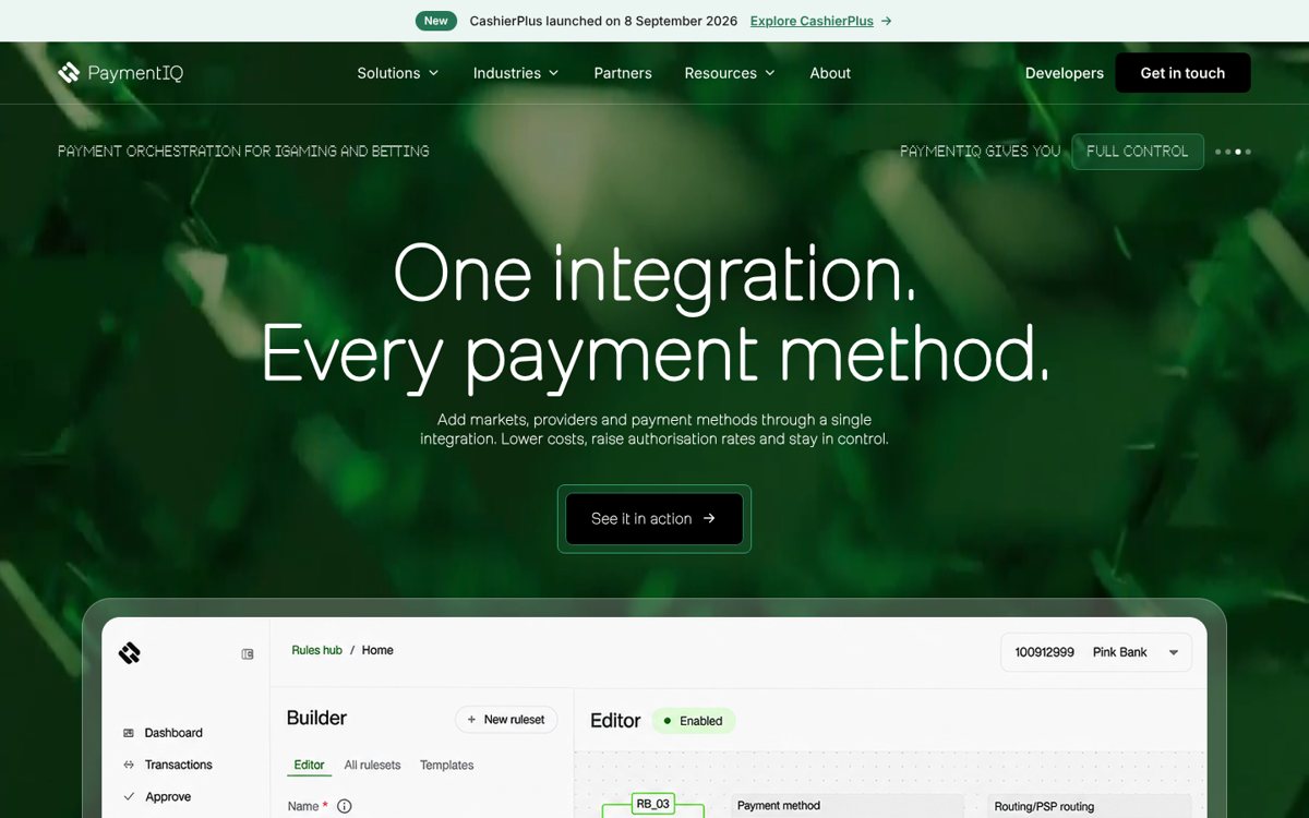
The client structure design follows the content order from your brief. It is the base both directions share, so we suggest agreeing this first.

  1. HeroVideo background, changing headlines and one main action.
  2. TrustCustomer logos straight after the hero.
  3. The challengeWhy payments get harder in every new market.
  4. Product and figuresThe Rules hub with the key numbers.
  5. Four solutionsOrchestrate, Protect, Expand and CashierPlus.
  6. Routing storyHow each transaction finds the best route.
  7. IndustriesiGaming, gaming platforms, crypto and trading, e-commerce and travel.
  8. Partners400+ connections through one integration.
  9. Demo and contactAn interactive demo, then a short contact form.

Step 02

Four approaches to the same brief

All four use the same messages and brand greens. The difference is in type, imagery and motion.

Client structure hero: green video background, centred headline and the Rules hub on a laptop

01 / Client brand & structure

Familiar, clear and on brand

Milling and Thermochrome type, product screens up front and a layout close to today’s site.
  • Easiest step from the current website
  • Product UI does most of the explaining
Open client structure
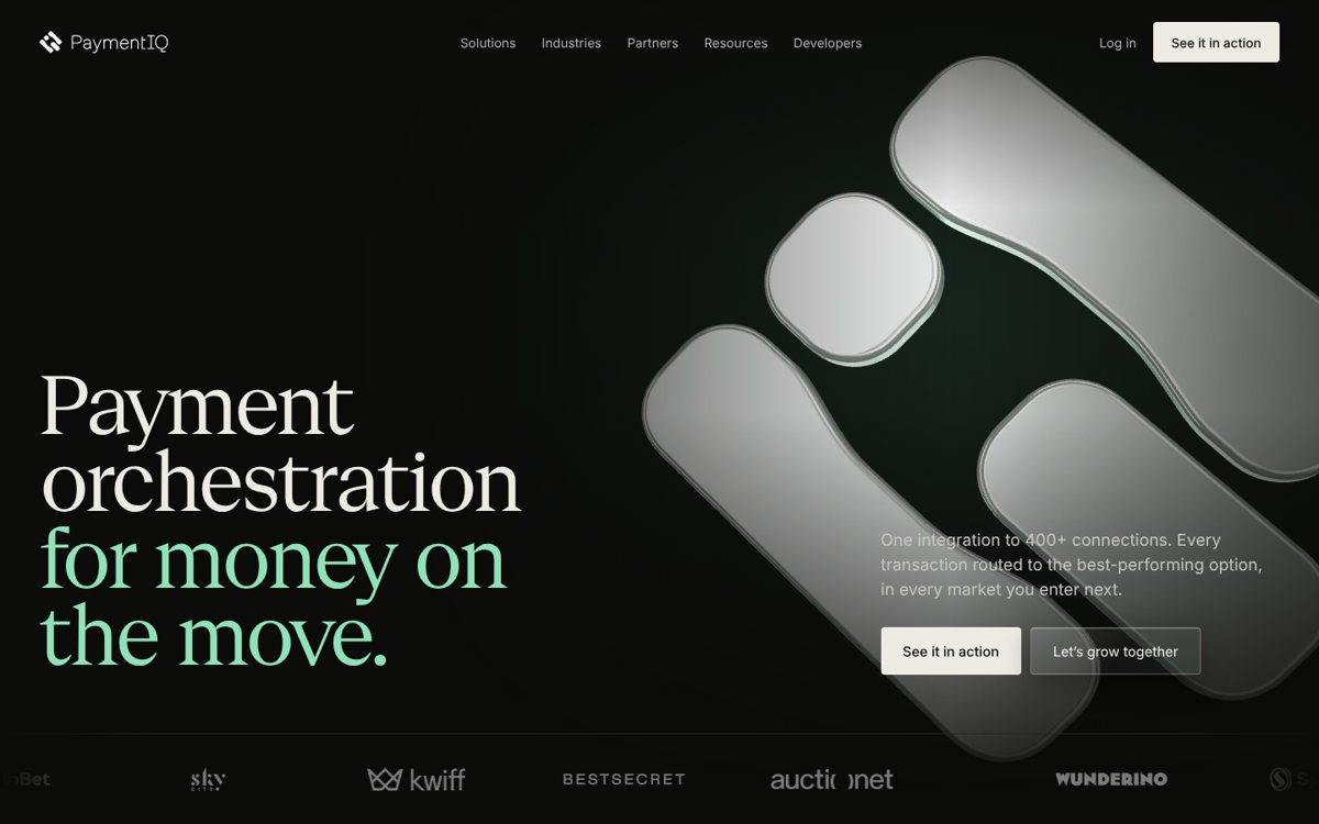
Editorial hero: large serif headline on black beside a chrome 3D PaymentIQ mark

02 / Modern finance editorial

Premium, confident and calm

Geist Serif headlines, a chrome 3D mark, more black space and fewer, larger statements. 02.b is an all-black version with a sculptural 3D hero.
  • Stands apart from orchestration competitors
  • Feels closer to a modern finance brand
Open editorial version
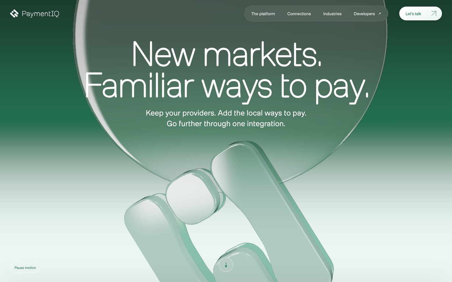
Scrollytelling hero: green glass PaymentIQ mark under a white headline

03 / Scrollytelling

Guided, immersive and on brand

Milling type and brand greens, told as one story. Sections hand over to each other as you scroll.
  • Keeps the client brand
  • Most memorable first visit
Open scrollytelling
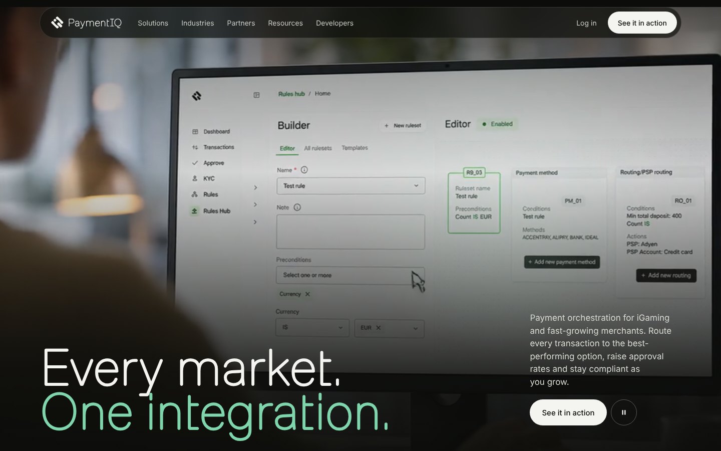
Video hero with the Rules hub on screen

04 / Video editorial

Human, cinematic and confident

A full-screen video of the product in use, then a move from dark to light with editorial type.

  • Shows real people using PaymentIQ
  • Strong first impression
Open video editorial

Step 03

Compare the parts

Each pair shows the same section in both directions. The questions under each are what we’d like to talk through with you.

Opening

Video and product, or one strong symbol

The first screen sets the tone. One shows the product straight away; the other leads with the brand mark and a short promise.

Client structure opening with video and laptop
01 · Video and laptopRotating headlines over video, with the Rules hub rising into view.
Editorial opening with chrome mark
02 · Chrome markA large serif headline beside the PaymentIQ mark in 3D chrome.

To discuss

  • Should visitors see the product in the first screen, or after the promise?
  • Do the changing headlines help, or would one fixed line be stronger?

Proof in numbers

Three ways to show the figures

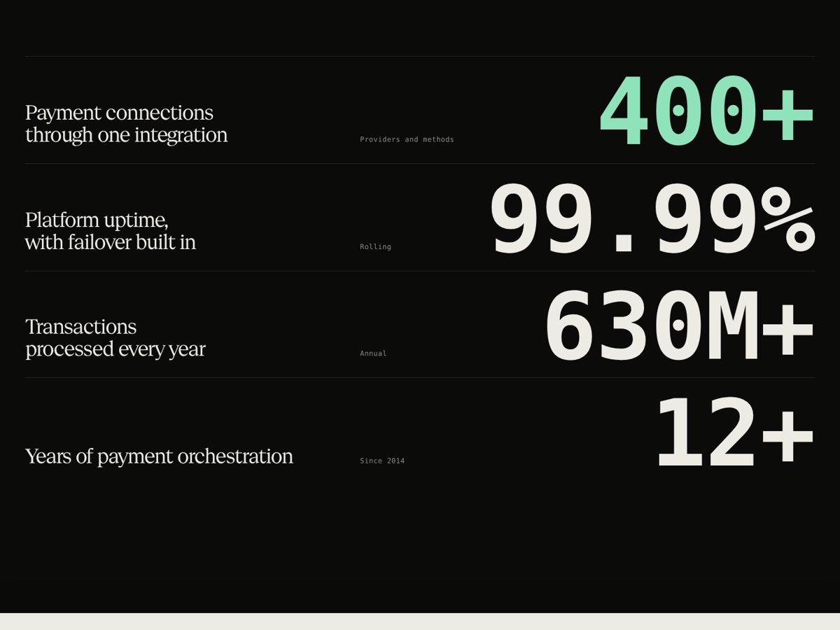
The numbers are among the strongest proof you have. Each version gives them a different amount of weight. Figures in the previews are illustrative.
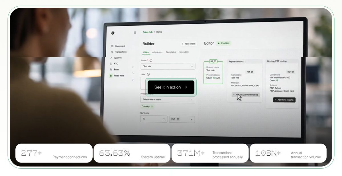
Stat cards under a product screen
01 · Stat cardsSmall figures under the product screen.
Large figures in a ledger list that count up
02 · Ledger count-upLarge figures that count up as you reach them.
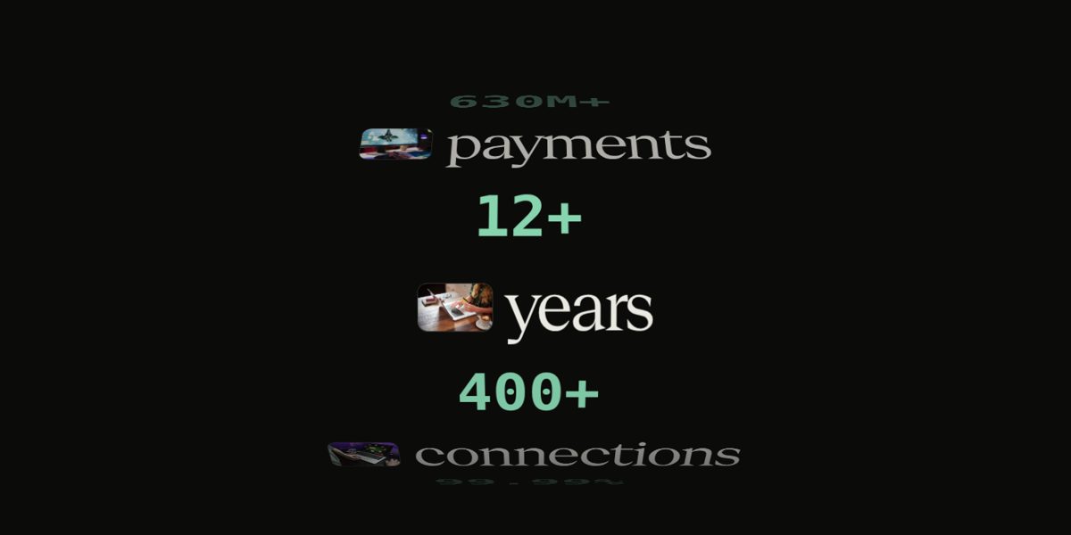
Figures on a turning drum mixed with words and photos
Alternative · Rolling drumNumbers and words turn past like a drum as you scroll.

To discuss

  • Which four figures matter most to your buyers, and can we use the real ones?
  • Should the numbers stay quiet, or become a moment of their own?

Solutions

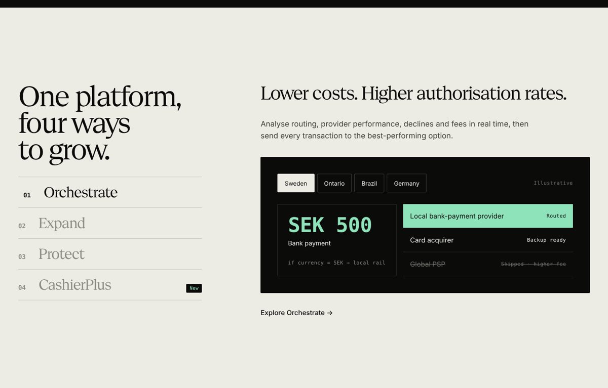
Cards with illustrations, or a pinned index

Both cover Orchestrate, Protect, Expand and CashierPlus. One shows all four at once; the other walks through them one by one.
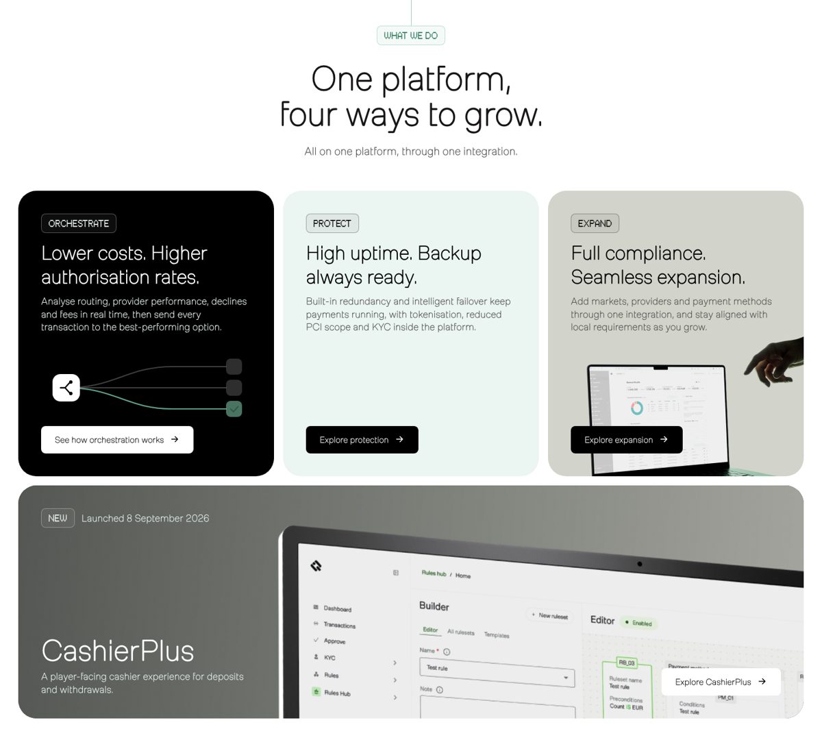
Bento grid of four solution cards with animated illustrations
01 · Bento cardsFour cards with small animated illustrations, CashierPlus given more space.
Pinned index of solutions beside a live routing panel
02 · Pinned indexThe list stays in place while the panel beside it changes.

To discuss

  • Should CashierPlus sit with the other three, or have its own section?
  • Is seeing everything at once more useful than a guided walk-through?

Industries

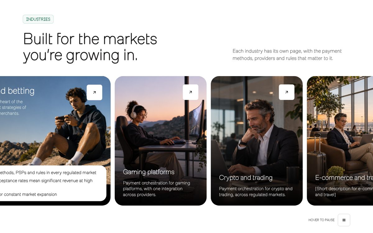
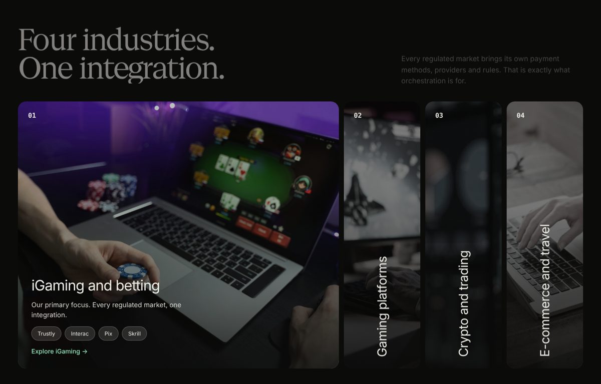
A slider, or photos that open up

Both lead to the four industry pages. The difference is how much attention each industry gets on the homepage.
Horizontal slider of industry photo cards
01 · SliderPhoto cards that move sideways, one per industry.
Tall photo columns where the active industry expands
02 · Expanding photosTall columns; the one you choose opens with its details.

To discuss

  • Is iGaming the lead industry, or should all four look equal?
  • Do we have real customer photography, or should we plan a shoot?